Landing Page Optimization: 9 Things You Need To Know
You know the importance of landing pages and you’ve got the basics of building those landing pages locked down.
But how do you move the needle on your conversion rates?
I’m not talking bumping your conversions up a few percent. I’m talking about conversion lifts in the region of 20-30%.
In this post, I’ll share a bunch of important concepts that will help you skyrocket your conversion rates.
Let’s get started:
1. Best practices are just the starting point
The web is full of articles on landing page optimization best practices.
But, just because something is best practice, doesn’t mean that it will convert the best.
Like many other marketing disciplines, landing page design is a nuanced topic.
For example, best practice tells us that the area above the fold is significant and that’s where your call to action (or CTA) needs to be placed.
And in most situations, that’s true. But, this case study from MarketingExperiments.com only had a CTA towards the bottom of the page. And it resulted in a 274% increase in conversions.
So, does that mean best practices are pointless?
No. Not at all. We still need best practices because they tell us where to start. But what do we do after? That’s when we need to start testing.
If you want to truly increase your conversions, you need to test different page variations against each other. Create a landing page design based on best practices and use that as your control. Then, create a variation that flips best practice on it’s head and see how it performs.
2. Target one persona with one specific message
The power of landing pages is in their ability to target a single buyer persona with a very specific message.
While your homepage may have to cater partly to several different personas, you can weave a specific buyer persona to each of your landing pages.
Then you can run paid ads targeting each persona specifically to maximise your conversions.
3. Videos could increase conversion rates or hurt your brand
Video is all the rage and it has been for a while now.
But, if you’re considering using video in your landing pages, it’s worth considering the downsides to video.
While they can work well at presenting certain offers, if you get video wrong, you could be not only hurting conversion rates, but also your brand.
A well produced video can act as its own form of social proof and add credibility for your brand.
Get the video production wrong and that social proof will flip to the opposite end of the spectrum. Something we call negative social proof.
4. The biggest changes will often result in the biggest lifts in conversions
When I was just getting started with landing page optimization, I’d test entirely the wrong things.
I was more focused on testing button text, and button color (cringe). Granted, these are all factors to consider in the landing page creation process.
But, they’re not going to get you the sort of conversion increases you desire.
You should consider testing:
- Headline & tagline
- Page structure
- Page length
- Overall design
5. Sometimes more conversions isn’t the answer…
In the quest for bigger conversion increases, it’s easy to get blinkered and focus too much on that single metric.
Particularly in the case of lead generation, it’s important to consider whether your landing page tweaks will get you the sort of leads you want.
While this may seem counterintuitive, in some situations, it makes sense to encourage certain types of people to deselect themselves from the process. That is, if they don’t align fully with your ideal customer.
6. Align your landing page copy with ad copy
Your ads set expectations and when users end up on a landing page where the copy doesn’t align - that’s likely going to hit you in the wallet and potentially hurt your brand’s reputation.
This is where landing page message match comes into play.
The solution? Think of your ad copy as a promise that your landing page needs to deliver on. And while it’s important to ensure your headline matches, don’t forget the rest of your landing page copy.
7. The design of your ad and funnel should be consistent
In the same way that your ad copy needs to match the copy of your landing page, they should also match up visually.
Not only that, but the rest of your sales funnel needs to be visually consistent too.
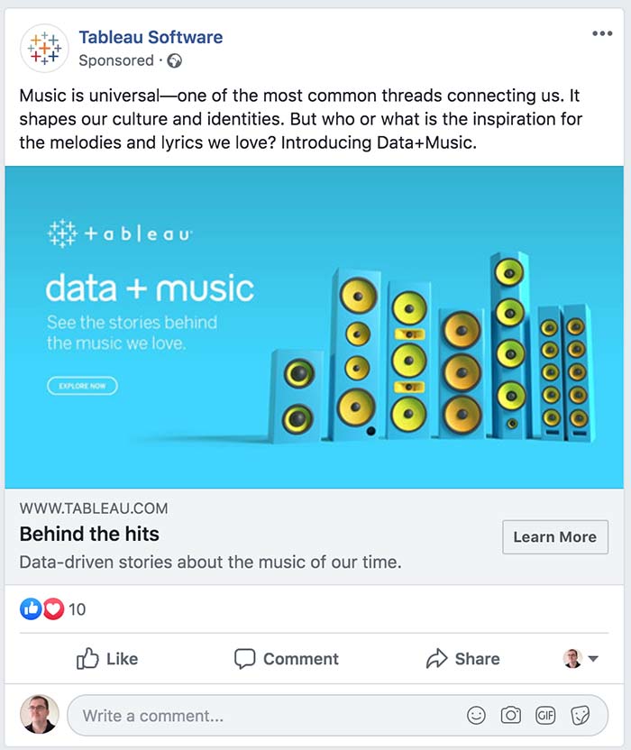
Take this Facebook ad from Tableau.com as an example:

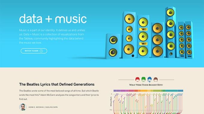
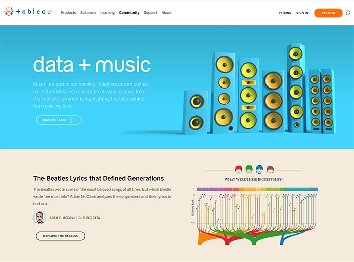
Now, here’s their landing page:

Not only do both have good message match, they also have good visual continuity.
And as a result, I got a stronger sense of confidence in the brand after clicking. I knew I was in the right place and that I hadn’t fallen victim to some weird FB ad type of Rickrolling.
The important next step is to ensure the rest of your funnel has a matching design.
Consider the page that visitors are sent to once they complete your ask. Typically this will be some sort of thank-you page (if lead capture is your goal.)
This is where the tool you use to build your landing pages can play an important role. A lot of landing page tools have large selections of templates, but they are typically designed in isolation.
I quite like how GetResponse offer matching thank you pages to go with their landing page templates. It can be quite a timesaver.
In terms of WordPress specific solutions, there are a number of cost-effective landing page plugins on the market.
Thrive Architect is a good example, particularly because their landing page templates are designed themed sets.
Not only do you get a thank you page that matches your landing page, but you get different types of landing pages, and a confirmation page in most sets.
8. Use dynamic text replacement to add relevance
One of the most effective ways to increase conversions is to leverage the power of relevance.
If an offer is more relevant to the visitor, they’re more likely to convert.
One way to do this is to use a landing page platform that offers dynamic text replacement. Whereby, part of the landing page copy is changed depending on a certain factor.
In a case study, Campaign Monitor received a 31.4% conversion increase when dynamically changing the verb in their headline, based on what the user searched.
The headline variations included:
- Build stunning emails
- Make stunning emails
- Design stunning emails
This further highlights the importance of the concept landing page message match, which I discussed a moment ago.
9. Pair your offer with the right landing page length
Should you use a long-form landing page? Or a short-form landing page?
The short answer is: it depends.
You’ll find all sorts of case studies that brands have published showing huge conversion lifts after switching up page length. After all, the most drastic page changes can result in the biggest gains (or losses.)
Some of these case studies will determine that long-form or short-form landing pages are better. But, the important thing is not what was better, it’s why it was better.
Typically, short-form landing pages tend to work better for low ticket (or free) offers. And long-form is usually the way to go for higher ticket offers.
Wrapping it up
We have talked through a bunch of different landing page optimization concepts.
By incorporating these concepts into your landing pages, you’ll see bigger conversion increases, along with more leads (or sales.)
Now, it’s time to put them into action.
This isn’t an exhaustive list by any means. Which concepts do you think are the most important? Are there any you would add to the list?
Let us know in the comments below.
Author bio:
Adam Connell is a content strategist with a background in SEO and email marketing. He used to manage the content marketing efforts of international brands. Now he teaches bloggers how to get noticed at BloggingWizard.com.


